How we began
The team started by reviewing the feedback section on the Google Playstore and the iOS App Store, which provided insights into our user frustrations and delights about the product. The product operations team were very helpful in providing essential feedback that were relevant to creating a product requirement document.
The app was initially used for transferring only to the other branch users and the user's primary external bank account. However, with the growth of branch, the company decided to change that and expand transfers to users of other banks.
The product operations team interviewed between 10-15 customers of Branch to get their views on their current experience.
Problem identified
After analyzing the research data, we found out that users were happy with the experience so far but requested for some processes to be faster which included the transfer process due to some banking counterparts having some other features. The bank was expanding and also wanted to add the ability for users to make transfers seamlessly to customers of other banks through the branch app.
The Team
- Product designer (My role)
- Product manager
- Product operations (User researchers and testers)
- Backend developer
- Frontend developer
Research findings
I proceeded to carry out an audit on the existing transfer process and utilizing my 3 years of experience in other banking organizations, I identified a few areas that could further optimize and enhance the experience of money transfer on the Branch app.
1. Branch had a unique way of signing up users with their existing phone numbers and with the right access made transparent to users, this could be relevant in displaying contacts that already exist on Branch thereby making it easier for users to quickly transfer to such contacts.
2. The process of inputting an account number to send money could be enhanced such that users would not have to scroll through a list of banks to find the exact bank of the recipient but we can already try to filter those out by identifying 5 probable banks with such account numbers and the user can select any of the suggestions or use the universal selector.
3. Adding the icons of the banks for the beneficiaries for easy and quick identification would help the users a lot.
4. Adding a narration field and a share receipt button so that users can share this with the recipients to confirm the transfer as this would be useful in showing transaction status.
Finding a solution
After going through the product requirement document handed over by the product manager, I proceeded to create design flows to showcase the cases for new and existing users. This process was also quick, thanks to the design system that was already put in place. We reviewed the designs in our design review session and the product operations team proceeded to test the designs.
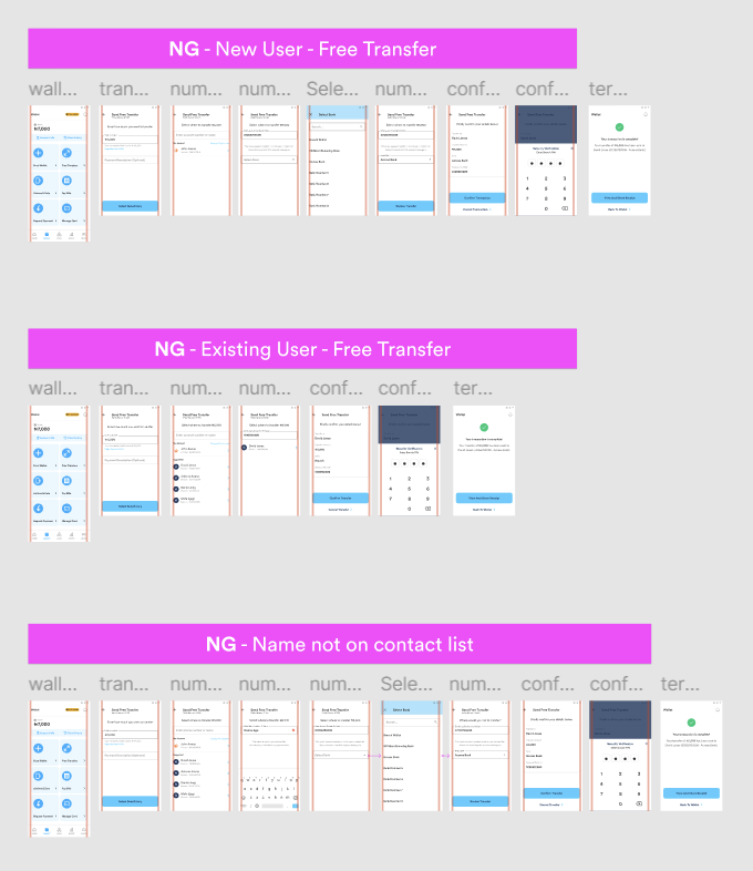
Previous design
The previous design had extra steps that made the process of transfer longer and adopting an extra transfer method for external bank users would make the process seem even more longer and confusing for the users.
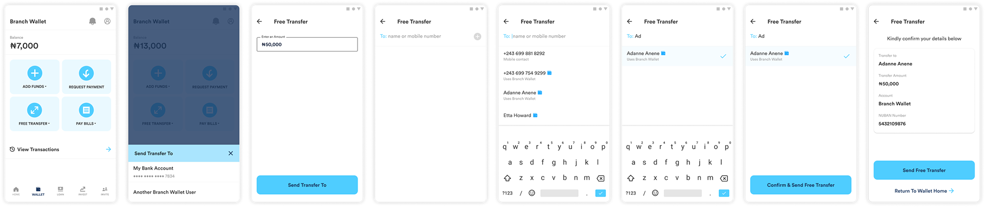
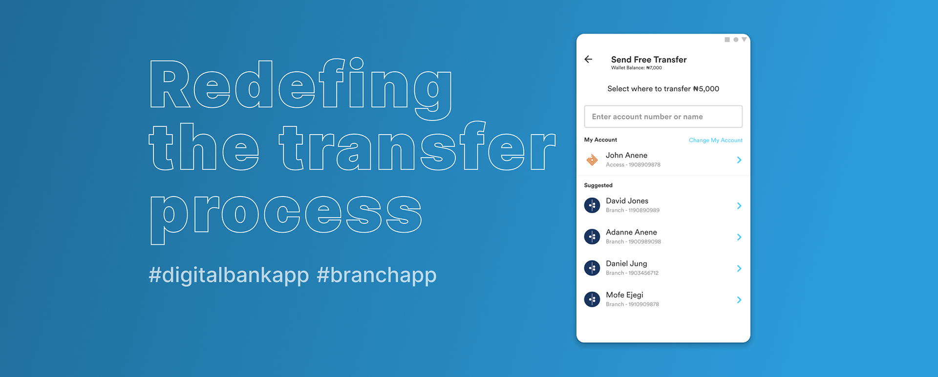
The proposed design solution
The proposed solution catered to all the data gotten from the research findings.
1. Before PIN verification, steps were reduced from 6 steps to 4 steps for existing users and 7 steps to 5 steps for new users, taking into account the new accommodation for external bank transfers.
2. The addition of bank icons to the beneficiary/suggested list made it faster for users to spot which beneficiary bank they wanted to send the transfer.
3. Adding a notification pill to inform users about the transfer fees depending on the amount provided clarity to the process flow for the users before they made their decision of transfer.
4. Preselecting the option of saving a beneficiary also made it easy and quick for users to save beneficiaries.
5. A clearer design for the input field for account number and name, made it easy for users to identify and understand.
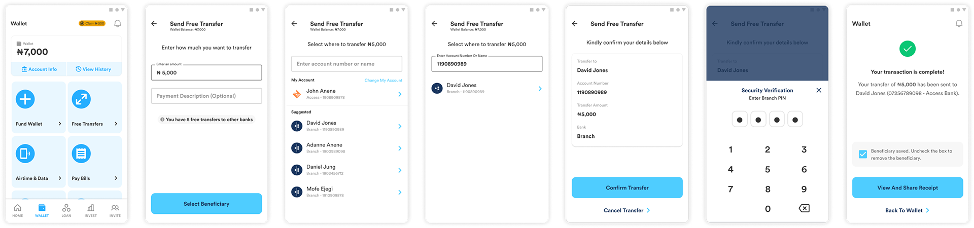
Design impact
The updates to the process flow and User Interface, made it easier and faster for users to complete their transfers successfully. A total number of 8 participants took part in the test which had a 100% success rate and they all commented that they were happy with it.
Due to the success of the design in the Nigerian market, we proceeded to use the same process in tackling the Kenyan market however, thanks to the integration of a third party platform, M-PESA, this made the transfer process a lot more easier for the users in that market.
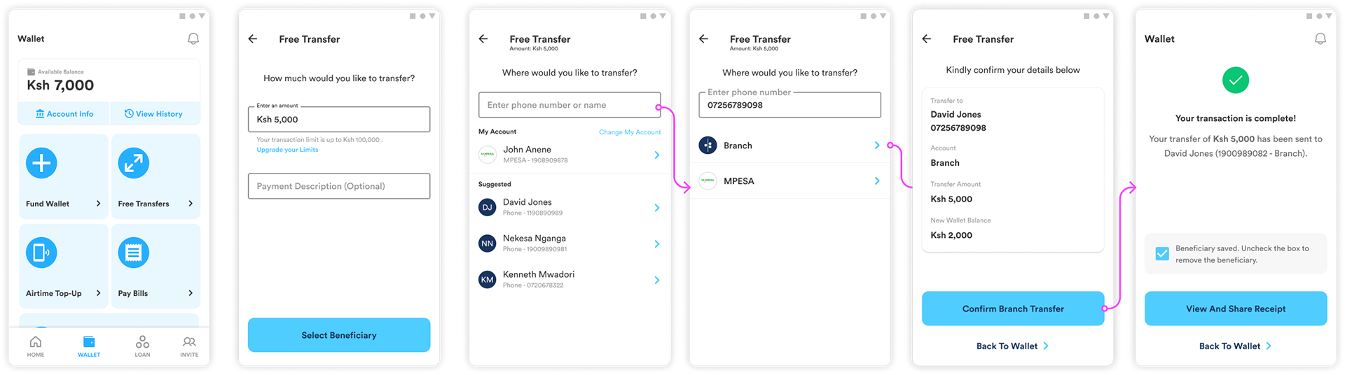
Screens showing the design representation on the Kenyan market.