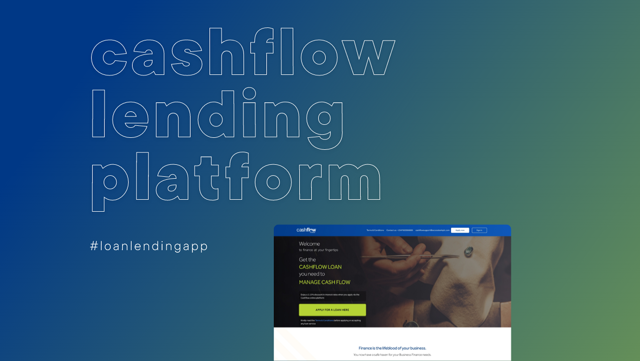
How we began
The process started by reviewing and auditing the previous compare feature. This feature existed on the old CMS platform that the company was now transitioning away from. We also reviewed the early implementation of this feature on the new CMS platform that the e-commerce website for the company was hosted on. The early implementation was done quite quickly and did not have a very friendly interface.
After this, the team collaborated with the customer service team to interview users of the feature and get a good grasp of what their needs are as regards using the compare feature.
Problems identified
After analyzing the data we got from all the research of auditing, reviewing and interviewing, I found out some issues:
- The previous compare feature used a drag and drop approach to select products which was quite difficult to use and not very accessible for the users.
- Users wanted to be able to copy the link of the compared products and share them with others while the page retained the comparisons.
- There was no clear way of showing what product was being compare with which and this confused some of the users.
- The journey of finding the compare feature on the product pages was not easy to find and this affected the usage of the feature as well.

Previous compare function iterations
The Team
- UX designers (My role)
- Product manager
- QA Testers
- Backend developers
- Frontend developers
Defining the user-flow
I started by mapping out the flow for the compare feature and made a little adjustment to make it more visible and reachable.
What happened previously was that users would have to go the specifications tab on a Product page before gaining access to the compare feature which was not well highlighted.

Old compare feature hidden under the specifications tab on a product page.
To make this more usable,
- The access from the specifications tab was moved to a top bar of the page that is also sticky
- The button style used was a secondary button for more attention and visibility.

New compare access button that is more reachable and visible.
I mapped out the flow and reduced the clicks from 2 to 1, to get to the compare function when going through a product page.

User-flow for Compare function designed in 2023
The solution on the Compare page
The solution for the compare feature took into account all the data gathered from the research and so
- I swapped the drag and drop function for a more user-friendly and accessible checkbox card style. This way, users could easily click on their choices and make their selections.
- Once the total number of comparable products was reached, the other options would get disabled and this was helpful in providing feedback on the limit alongside with the text explanations.
- I collaborated with the developers to ensure that users were able to copy and share the link and that it would retain all the information on the page.
- I ensured the products being compared were highly visible and distinguished with a sticky header in the desktop view that made the users know what products had what specifications.
- I ensured the designs were in line with the design system for site consistency as this would also appeal to the emotions of the users as well as add a bit of trust.

New compare feature designs
Another advantage of the new design was that it was responsive while the old ones were not. This made it easier for users to use the website especially the compare function, on mobile and tablet devices.

Design impact
The compare feature has been and is still useful for both end-users and customer service in determining the best value and relevant product that fits their needs. Redesigning this feature and making it more usable and user-friendly making the page maintain a drop-off rate of just 2.4% measured via hotjar as of February 2025.

Statistics of compare product page via hotjar