How we began
We started by reviewing the feedback section on the Google Playstore and the iOS App Store, which provided insights into our user frustrations and delights about the product.
We collaborated with the customer experience team to get more information about our customer’s behavioural patterns, experience with the existing mobile app, and general feedback about the product.
Problem
After speaking with users and researching on other apps, we found out the onboarding experience of new and existing users was sometimes an issue for customers so we derived our first major task for the product.
Another major problem was the accessibility and discoverability of the bank’s services on the main dashboard. Most of the app features lacked engagement because users couldn’t locate them. Also, users wanted to be able to personalise their quick services according to the ones they used the most on the bank app.
The Team:
- Product designer
- Product manager
- Customer Experience
- Project manager
- Business Analyst
- Backend developer
- Frontend developer
My role:
- Product Designer
Conversations with our customers
The team conducted user research interviews with our customers to better understand their frustrations with the existing mobile app.
We interviewed 25+ customers aged range between 18- 50 years old across 15 states in Nigeria. Some interviews were face-to-face, while the others virtually because of time constraints.
Research Goals:
1. Identify and understand issues with the account opening process.
2. Understand problems our customers encounter on the mobile app.
3. Get insights about user behaviours and patterns.
Discoveries from the research.
The user research revealed some of the concerns users had regarding the onboarding process and generally about the app. It also gave us an idea of some of the things we needed to prioritize for the redesign.
We categorized some of the issues into different epics.
Account Opening:
80% of the customers stated that the main reason for dropping off is because it was mandatory to enter your bank verification number and fund the new account even before getting an account number.
Another issue was the time taken to validate documents to open the accounts. Some even complained of getting errors and not knowing what to do next.
Redefining the onboarding process
We discovered that asking potential customers to fund their accounts at the beginning of the account opening process impacted the onboarding process negatively.
1. Customers complained about the bvn field (bank verification number) being mandatory for the account opening process.
2. The document verification process had a relatively mid-success rate. When it failed, customers did not know how to proceed because there was no error recovery management system, hence the need to visit a bank’s branch to continue the process.
3. They wanted to get their accounts opened instantly in fewer clicks.
Finding a solution
We had several meetings with stakeholders and discussed how we could make the onboarding process seamless.
1. We initially wanted to remove the option of providing BVN (Bank Verification Number) when opening an account, but this was a very important regulatory requirement and so, we agreed to make it an optional field instead attaching different access features for either option taken.
2. We collaborated with the tech team to find a vendor with an API having at least a 90% success rate for document verification.
Designing the User journey maps and flows.
Through the research gotten from the Products team and working together with the customer experience team as well as the development team, the design team was able to come up with several flows to meet user needs and achieve business goals for each of the 40+ features on the intended product.
Below is an example for a singular sheet containing several flow samples which we designed using an online collaborative user flow diagram tool called Cacoo.
Some of these flows were tested and re-iterated upon several times in order to provide a seamless and smooth experience.
One of the challenges that we wanted to solve was the onboarding experience which this flow helped to provide a clearer view for us.
One Advantage to note about user flows is that they make all stakeholders aware of the intended experience for the users and developers can start working on any backend services or processes that needed to be worked on.
Wireframing
Once I had a better understanding of what I wanted to do and the issues to tackle, I took some time to wireframe some ideas for user testing.
From the user flows and journeys, the next step we took was to design wireframes to give an idea of the interface and test it with stakeholders which we did.
The insights gotten from the wireframes helped in informing our design decisions for the design system and hence, the prototypes.
Crafting a design system for consistency.
After working on the wireframes, one of the things we wanted to achieve also was consistency. The importance of consistency is so that users are not confused about the colors, buttons, texts, icons, forms and illustrations as well. Also, being a financial app, you do not want users to find the app sketchy so maintaining a design system for efficiency, consistency and a satisfactory visual appeal was very key in the design process.
To achieve a good design system, we made use of the Atomic design approach by starting from Atoms to molecules to organisms to templates and then pages.
We achieved this on Adobe XD by creating components and making different states for those components as well.
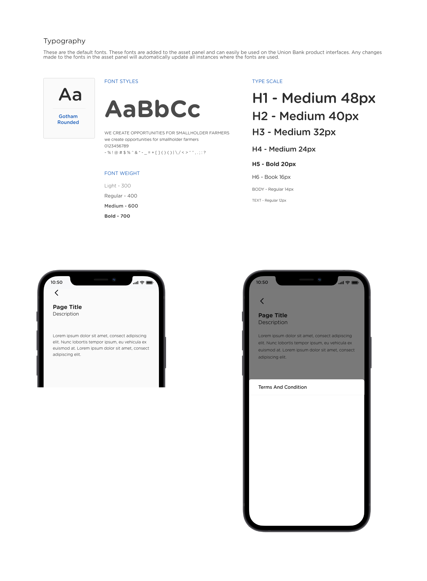
Typography
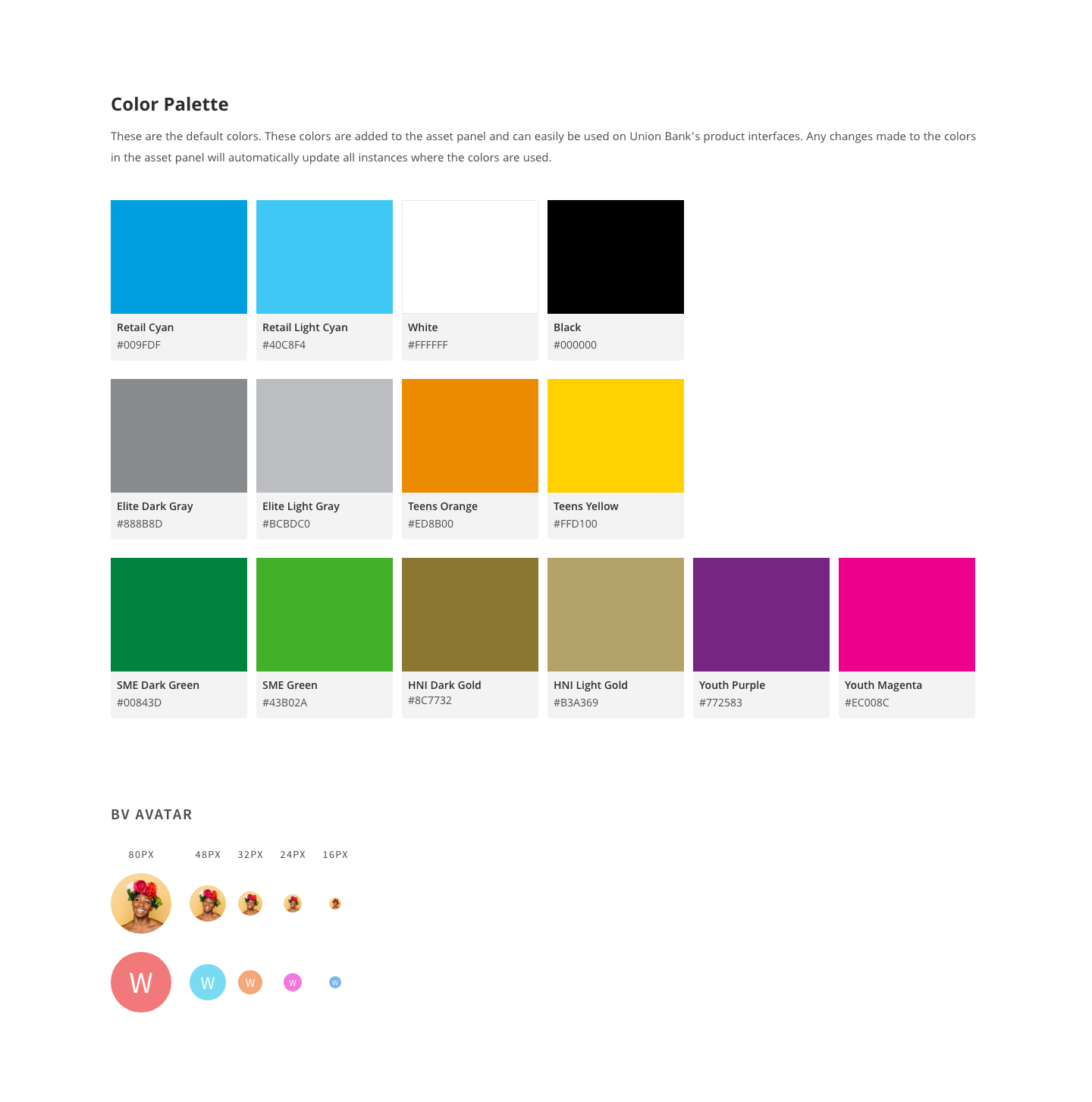
Color

Buttons
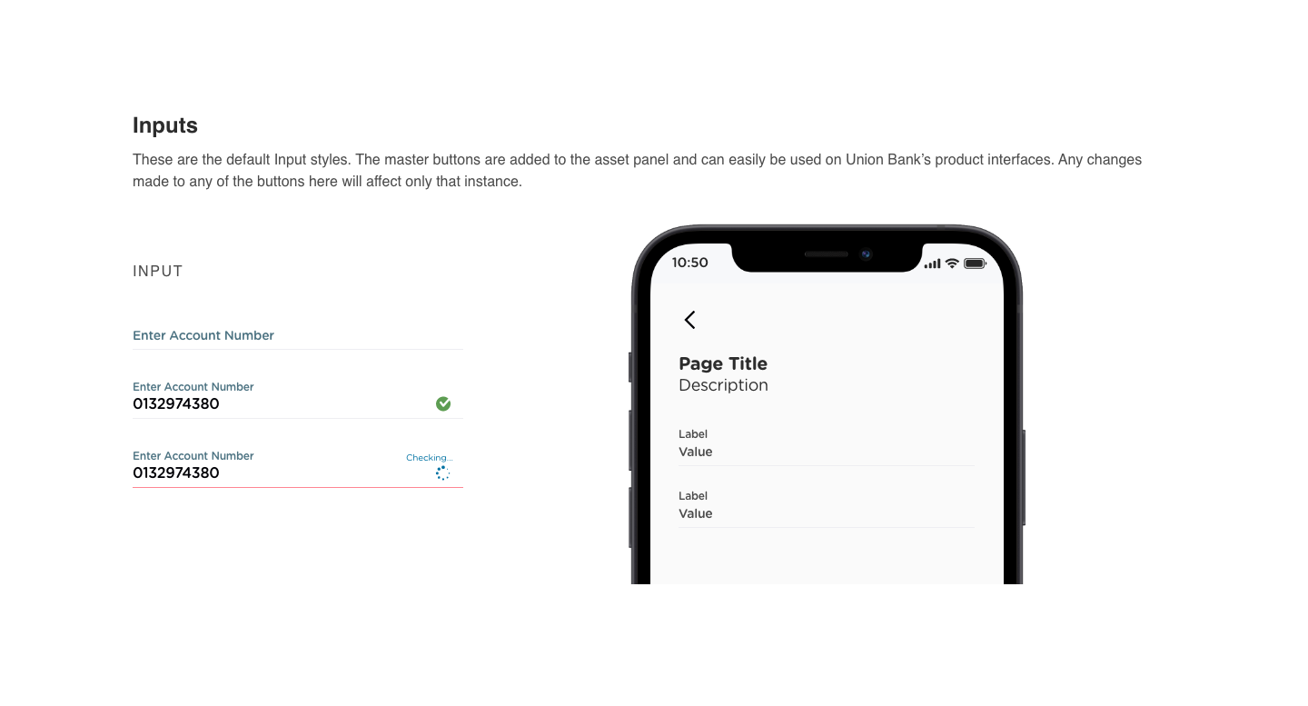
Input Field
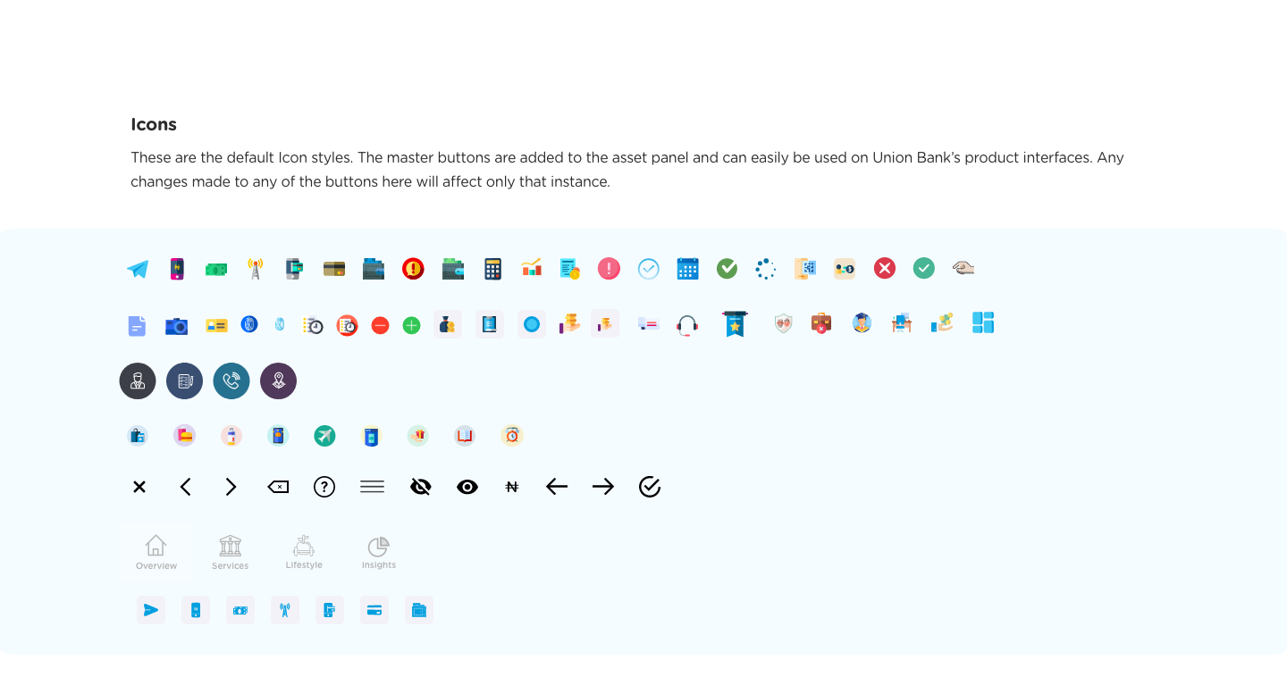
Icons

Tiles
Prototypes
Straight-through account opening process:
There was already an existing account opening process which was designed by the design team earlier and so we reiterated on that opening process and further enhanced to make it smoother and faster with less hassle.
One of the key things we did, was make the BVN field optional and also provide an opportunity for those that did not want to present their BVN field at the initial point of opening an account.
The Existing Iteration
The Proposed iteration
The proposed solution took into consideration the usability heuristics from NNgroup and one key aspect of that was error prevention. So the app was designed to be as intuitive and flexible as possible so that users are not stuck at any particular point.
This solved the onboarding experience problem and achieved the goal of getting users to instantly open an account with the organisation. A usability test was carried to verify the designs and the results were outstanding with many saying the process was not only easier and simpler for them but also very satisfactory that they were not compelled to provide their BVN at the initial setup stage.
Making this process instant like this meant skipping some KYC regulatory requirements such as ID card and Signature. To make it a smooth experience, we added a recommendations tab on the dashboard which suggests to the user about upgrading their accounts to gain more benefits. Once the user taps on that card, the user sees a pop-up of the advantages of upgrading and how easy it is to do.
This kind of experience does not overwhelm the user during registration and makes the user more comfortable whenever they want to upgrade their experience.
The Upgrade Experience
Dashboard:
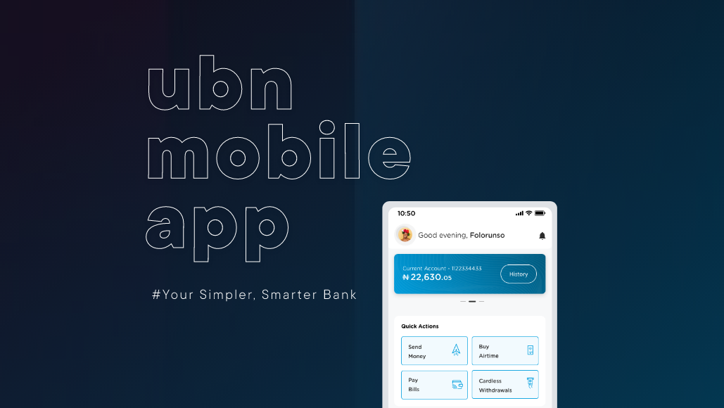
We redesigned the dashboard and gave the users more control to choose what quick actions they wanted to display on their dashboard.
Users also now had the choice to easily fund their accounts as well as view their transactions.
Quick services on the dashboard
One of our goals was to give users access to quick services on the dashboard, and what better way to find out the top services than to speak to our customers. We designed a survey listing all our banking services and requested that they selected their most frequently used. The survey results helped in determining the quick services to show on the dashboard.
The Existing iteration
The Proposed iteration
The Proposed Dashboard Experience
Funds Transfer
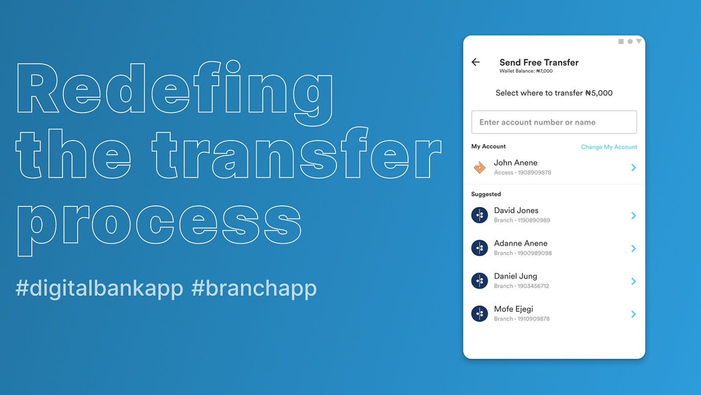
We also worked on the funds transfer screens and made the process a bit more intuitive as well as with the new design system in place.
Nearby Payment
The addition of nearby payment feature was key as well as this allowed users leverage on the distance between the payee and the payer to facilitate rapid transfer of value. This utilises the Bluetooth capability present in smart devices to ensure a smooth and transaction without exchange of physical address of any form.
A case study we looked at for this was a scenario where a user visits a restaurant with some friends on the user's birthday. As they finish eating, a small invoice is passed to the user detailing the total amount spent on food and drinks. The invoice contains the instruction to make payment from where the user is seated. The user logs into his digital bank app, selects nearby payment, searches for the restaurant terminal, enters the invoice ID and completes the payment. A payment receipt is issued to the user automatically from the digital bank app.
Utility
Customers can search for a biller of their choice, get access to the most popular bills, and see their most frequently paid bills. The bills are organized into various categories for easier accessibility.
Impact
The proposed impact of this is that this should bring about at least a 10% growth in customer acquisition and retention within a year. Due to the COVID-19 pandemic, a lot of people are starting to prefer being able to carry out tasks online without visiting a physical office. The same applies for banking. Therefore, a lot of users would prefer that they are able to seamlessly and instantly open accounts without any hassle. This is what this case study seeks to solve and from usability tests carried out, the users were really intrigued with this and would have loved to see an implementation of this in the society today.
The current Union bank mobile app currently has over 1,000,000+ downloads on the IOS App Store and Google Playstore. So, one can imagine the reach that this proposed app will have.
